


A Brief History of Tumblr Layout Changes and Why I’ve Hated All of Them
But let's be real, I'm never actually going to leave.
![]()
Tumblr and I have been through a lot together. I first got mine about four years ago, back when Tumblarity was still a thing and people actually respected David Karp as a person, and I’ve hated it and loved it in equal amounts ever since. At this point I’ve started to experience something not unlike highway amnesia when it comes to the now ubiquitous blogging platform — I’ll open Google Chrome while trying to show my roommate a Youtube video on, you know, Youtube, and all of a sudden I’ll find myself three pages deep into my dashboard with no idea what just happened. But the more time I spend on the website, the more I tell myself that I really need to give it up and find some new social media hangout, because the sheer amount of changes they’ve made to the site and the way that they’ve handled every single one send me into a mini rage spiral every time I think about them. I can feel my teeth grinding right now, guys.
Now, I would blame the most recent layout updates on Yahoo, but I can’t do so in good conscience. It seems like the perfect time to do so, seeing as Yahoo recently bought Tumblr and has been going on about how they want it to change it reflect their deep and abiding love for brand advertising. They’ve announced their intention to do sponsored content, which, fine, whatever. We do sponsored content here; it’s how we make money. I won’t deny anybody the opportunity to get paid for Internet work because that would be massively hypocritical of me, the professional Internet worker.
However, while they’ve put out more changes than they usually do at once over the past two days, there’s a larger issue here, and it’s not Yahoo’s doing. No, Tumblr’s been taking the features that people love and dumping them out on the floor and stomping on them for the entire four years that I’ve had one. Remember when we used to be able to send people as many “asks” as we wanted and even put links in them? Karp did not like that, because we were were all using it as a private messaging system. Did we stop doing that when he introduced Fan Mail as its shitty replacement? Not really. I mean, look at how cheesy Fan Mail is.
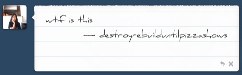
Complete with customizable fonts and “paper” backgrounds that nobody wanted that can’t be made smaller and disappear as soon as they are sent, so you can’t go back and check what it is you wrote to people. And then it even signs your username at the end, because that’s not dumb. Every time I get Fan Mail from someone, I think, “You were probably just too lazy to go find my askbox, weren’t you?” And these are dear, dear friends I’m talking about, and I’m still totally right about that lazy thing, because nobody likes Fan Mail. Fan Mail is the calzone to the ask function’s pizza.
You know what else nobody liked? Pins. That sound you just heard was the hundreds of thousands of Tumblr users blanching at the mere mention of Pins, because they were awful, too.
Imagine being able to ensure that your very important post was the first thing that your followers saw when they logged onto Tumblr whether they liked it or not! And then add a dumb animation of a pin falling down when they tried to get rid of it! Those are pins. They were sort of the precedent to sponsored content, but worse, because sometimes you would get people pinning pictures of their dog so everyone could see them. They were so awful that even Tumblr noticed that nobody was using them anymore and quietly put them out of their — well, really, our — misery.
There have been other awful changes too. They keep putting limits on the number of pictures you can post in a day or the number of text posts or asks (and then there was the character limit on asks, which don’t even get me started on that). And then they completely reworked the “new post” function so that it no longer automatically saves for you, which used to be such a godsend. After all that, it was only a matter of time before they decided to move all the buttons around so that nobody knows where they are anymore. Really, that was the logical next step.
So here’s where they used to be before:
And here’s after:
(Nevermind the space icon, that’s not new — it’s from a chrome extension I use that lets me completely block things I don’t like. Note that after all the new changes, it didn’t work for about three or four days. Neither did Tumblr Savior, which allows you to hide posts with certain phrases to keep you from getting spoiled. Pretty great that the new layout made it stop working right in the middle of peak Arrested Development spoiler time, huh?)
People will tell you that having the functions at the bottom of the post as opposed to the top is actually better because you don’t have to scroll as much, but I disagree. I think it looks clunky. Most of all, though, I’m still mad about that moment of sheer horror I felt when I went to edit a post with a typo in it and could not find the edit button. The buttons could be in the best most optimal place on all the Internet and I would still hate them, not because I hate change but because I hate it when websites I go on all the darn time make me feel like an idiot.
And now — literally while I was putting together notes for this piece on Friday— they brought in the giant quotes.
I really liked the quote function up to this point — actively, too, not in hindsight. They always worked just fine, and they were great for getting just the right amount of attention from the eye, even with longer blocks of text. There was literally nothing wrong with them and there was no reason why they needed to be changed.
But then all of a sudden, the text begun to appear in 48pt font, in stark contrast to the rest of the website’s 14pt. Or, as The Frogman put it:
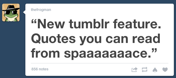
Looking at this, I feel like I’m being yelled at. If I wanted to feel like that, I would go into the Sherlock tag and say something nasty about Benedict Cumberbatch’s chin! (speaking of which, remember when the tags weren’t in a drop down menu? That was nice, too, while we’re complaining about things).
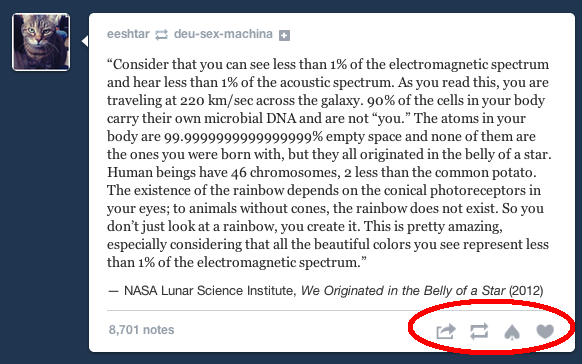
And you know those longer blocks of text I was talking about before, the ones worked just fine — you know what they look like now? For a brief moment, they looked like this:
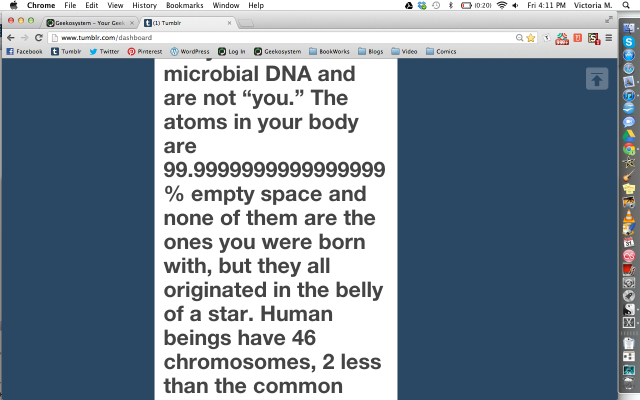
What even am I not-reading right now? I mean, I think it might be something vaguely inspirational and wondrous about science and humanity, but I have to scroll for actual miles until I reach the end and by that point I’ve forgotten everything about what I was just trying to read.
But of course, once everyone really started to settle in and find new ways to complain about the giant quotes, they went and changed the font on us again.
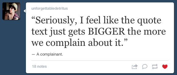
Now its size is dependent on how long the quote is, so the above hopefully shouldn’t happen again. I’ll concede that it actually doesn’t even look so bad anymore. If they’d told us it was coming or at least chosen not to roll out the changes in the way that they did, it probably would have been fine.
And that is actually the biggest problem I have had with literally every single change Tumblr has ever made — they never, ever tell their loyal (to a point) users that they are about to make important changes, meaning that when they occur, everyone is completely disoriented and can’t navigate the site properly for days. People complain about Facebook every time the newsfeed gets a makeover, but at least Facebook has the courtesy to gently let you know that updates are coming before they’re actually implemented. For example, this popped up when I logged in last week and has been there ever since:

Isn’t this thoughtful? (Yes, I play the Marvel Avengers alliance game, shut up). They give you the option of trying out the new look for yourself before they force it on you. They have more information about what’s going to change so you learn more if you so choose. And, most importantly, they tell you that it’s coming in the first place. When you know it’s coming, you can go through all the five stages of change grief and come around to acceptance just as you actually have to deal with the change itself. I can’t tell you how many times I’ve heard everyone whine about Facebook changes for weeks before trying them out myself and thinking they weren’t so bad. With Tumblr, the exact opposite tends to happen.
“But sometimes they mention the changes they’re going to make on the Staff Tumblr,” some of you who just like to argue are probably saying right now. Yeah, but that’s like if Facebook announced their changes on your newsfeed instead of right on top of it in a big unavoidable part of the screen. And besides, did they say they were going to move the most important buttons on the screen someplace else before they actually did it? No, they didn’t. They haven’t said anything about it at all.
But who am I kidding, really? I’m on Tumblr right now in another tab as I’m writing this. I spent all of last night freaking about Game of Thrones on it. I’m probably not going anywhere soon, as much as I complain. It’s already got its talons in me. I don’t know where else I would spend my Internet time. It’s too late for me, but you! You new users and Yahoo fans or whatever! There’s still hope for you. Don’t make the same mistakes we did! Go outside or something! Live!
I guess at least those of us who can’t escape Tumblr’s clutches have got those giant adorable like/dislike animations that float around and break when you “unlike” them, now.
Wait, just kidding, I hate those too.
- Yahoo has promised they “won’t screw up” Tumblr. We’re not certain…
- Drawings Against Humanity is one fine piece of Tumblr
- Where were you when Yahoo bought Tumblr?
Have a tip we should know? [email protected]