

An Artistic Critique of Milo Manara and Greg Land’s Controversial Spider-Woman Covers
Alternate title: "Milo Manara's DisHEARTening Spider-Woman Variant Cover Gets An Artistic ReBUTTal"
[slideshow id=2452]
After seeing Milo Manara’s recent, erm, anatomically improbable Spider-Woman variant cover, plus the regular cover by Greg Land, artist Karine Charlebois (@Kanthara) was compelled to take her to blog Less Tits N’ Ass, More Kickin’ Ass to do a little corrective work. Here we have her art and commentary, republished with permission. You can see more from Karine on Less Tits N’ Ass as well as her personal blog.
It’s a two-fer! Courtesy of @dcwomenkickingass, and specifically this post, I had to do an edit of these, while my storyboards wait.
I’m not going to go into long explanations here, I hope the drawings do speak for themselves. In the first case, it’s a Land being Land, although I do have to say that he did give a butt to Silk, as opposed to his usual ablation of hips and gluteus maximi. However, he unfortunately did it wrong.
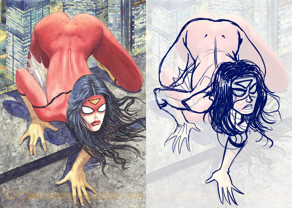
Artistic anatomy is all about drawing structure, from the inside out. Your muscles by themselves can’t look right if they aren’t placed on top of a properly proportioned skeleton. Boobs won’t look right if they aren’t drawn as following the curve of the ribcage, its center line, or the movement of the arms which either pull or push on the pectorals on which the breasts hang. The arms back mean the shoulders are lowered, and the angle of the hands will be different since there’s a 3/4 turn on the torso. It shows that Land is drawing by guessed shapes, copied contours, and practiced repeated motions. There’s no real structure underneath his shapes.
And if we look at the legs, I can only picture Kitty Pride phasing out of a wall: the legs look like they got mangled up to look like stumps. But even structure-wise, there is no thought put into whether the pose actually works, which is why it looks so clumsy. The legs should be reversed due to the line of action that’s in the torso but not followed through into the pelvis and legs. And I’ve been using the coil technique a lot in order to make my volumes work—it should be obvious by the roughs above—which help me figure out things like foreshortening.
Silk too was a problem of lack of structure, proportions all over the place, and lack of weight and purpose, but it felt moreso than Spider-Woman. I used the same pose Land did but worked out the skeleton first, using rotation arcs in order to properly proportion the length of the various limbs. I don’t know these characters and I might not have used these poses, but Silk here definitely looks like she’s dancing.
The variant cover by Manara looks like a pose right out of porn, pelvis up and cheeks spread, costume looking like body paint, and it makes me very uncomfortable. She doesn’t look like a superhero about to strike, she looks like she’s about to get… well, it’s a porn pose. This is sexualisation. It also reminds me of the Dog Bone sexy shape.
So I turned the pose sideways to figure it out and to see what would work better. The sideways pose as-is, as you can see, is angled to do quite the opposite of ass-kicking. Were she to try to leap from that pose, she’d fall flat on her face. The second pose is the “coiled like a spring”, but in the camera angle of the cover, it’s an ugly, ugly pose. So I tried to do something in-between, and just by making the pelvis horizontal and lifting the torso off the ground, I’ve managed to move the center of gravity so her weight is on her feet instead of her knees, she can use her arms to maneuver in most directions, and you still get an interesting body shape to look at. I think this works better, and she’s much more ready to spring into motion.
Are you following The Mary Sue on Twitter, Facebook, Tumblr, Pinterest, & Google +?
Pages: 1 2
Have a tip we should know? [email protected]