15 Retro Video Game Company Logos and their Modern-Day Counterparts
Last week, gaming developer Rare changed that golden logo we remember so well from Donkey Kong Country and Goldeneye to a new, more ‘modern’ logo in commemoration of its 25th anniversary and its newfound focus on Project Natal. It’s always a bit of a shock when a brand we know well radically changes its look, like a friend getting a new haircut that we don’t know what to think about, but Rare’s redesign reminds us that a lot of the gaming logos that greet us on the sides of boxes and on startup screens haven’t been around forever.
Below, Geekosystem has put 15 video game companies’ old-school logos side-by-side with their modern counterparts. Which do you like better?

1. Rare
Rare chief: “we felt now was the time to have a new image more in keeping with an innovative and creative entertainment company which aspires to be around for at least the next 25 years!” But oh, how we pine for their N64 days.
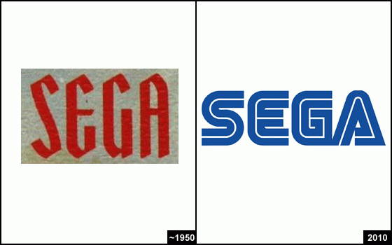
2. Sega
Before they made video games, Sega made mechanical arcade cabinets, although their old logo looks more like something you’d see hanging on a banner over a medieval great hall.
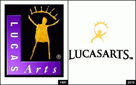
3. LucasArts
Back when LucasArts was called “LucasFilm Games,” it had yet another logo, but the golden sunshine man that you remember from the side of your Rebel Assault game back in the day has persevered since 1991. At that, he got a facelift with a less crunchy look in 2005.
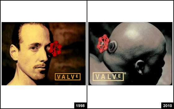
4. Valve
Which is creepier: A red valve in a thinly moustached man’s eye, as we saw in the first Half-Life, or a red valve plugged into the brainstem of a scary bald wrestler man? The jury’s out.
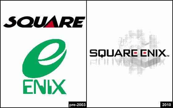
5. Square-Enix
When Square and Enix merged in ’03, Square’s color scheme won the day. Here’s hoping the castle in the background is some sort of EarthBound revival clue that no one’s yet decoded.
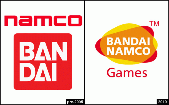
6. Namco-Bandai
Without getting into how Namco’s pre-merger gaming legacy was vastly superior to Bandai’s (sorry, Mighty Morphin Power Rangers for SNES, but Pac-Man and Galaga got you beat), how oh how did two red-and-white logos merge into a freakish, ugly love story between a red and a yellow amoeba?
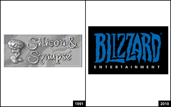
7. Blizzard
Yes, Blizzard used to be called “Silicon & Synapse” and have a grumpy, anthropomorphic brain wearing shoes as its mascot. But its current logo is still pretty old-school: It’s been basically unchanged since 1994.
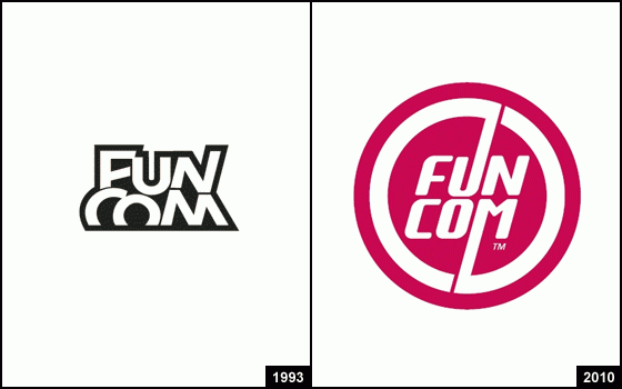
8. Funcom
Age of Conan developer Funcom traded its kooky ’90s trapezoid for a red circle that vaguely reminds us of LG.
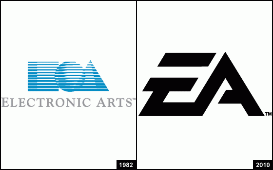
9. EA
Apparently, EA’s old logo confused people.Wikipedia: “Many customers mistook the square/circle/triangle logo for a stylized “EOA.” Though they thought the “E” stood for “Electronic” and “A” for “Arts”, they had no idea what the “O” could stand for, except perhaps the o in “Electronic.” An early newsletter of EA, Farther, even jokingly discussed the topic in one issue, claiming that the square and triangle indeed stood for “E” and “A”, but that the circle was merely “a Nerf ball that got stuck in a floppy drive and has been popping up on our splash screens ever since.” It’s still enough to induce waves of nostalgia in anyone who’s played Starflight.
10. Epic Games
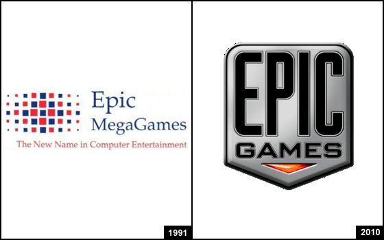
Back when it was called “Epic MegaGames,” Epic’s logo definitely had swagger, declaring itself “the new name in computer entertainment” with a decidedly ’90s box array; today, it rocks a badge that isn’t out of place alongside the shooters and action games that are its trademark.
11. THQ
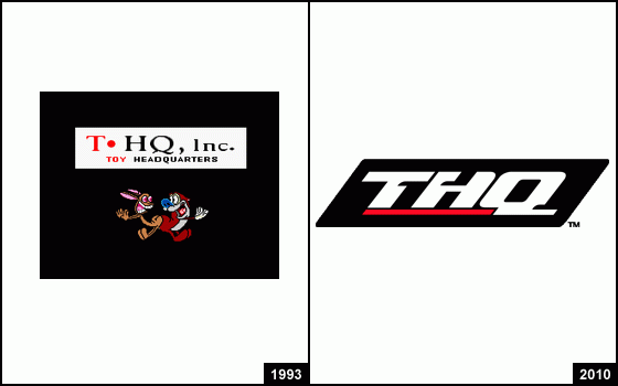
As much as I would like to objectively compare these, the presence of Ren and Stimpy in the logo to the left shifts my allegiances irreversibly in that direction.
12. SNK
Since the modern SNK’s removal of serifs is not particularly earth-shattering, here, have a cool, possibly true story about the origins of SNK vs. Capcom, the fighting game which took the maybe-too-bold-but-still-fruitful step of assuming that rank-and-file gamers had any idea what “SNK” was.
Street Fighter Wikia: “The supposed origin behind this series was an issue of Arcadia magazine in which there were articles covering both The King of Fighters ’98 and Street Fighter Alpha 3, both of which were released at around the same time. Readers had misread the cover, which said KOF vs. SF, to mean that there was a fighting game that would pit characters from the Street Fighter and The King of Fighters series.”
13. Bethesda
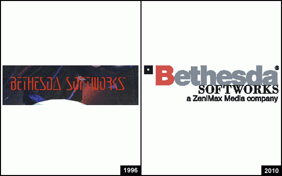
Can’t say I’m crazy about the current logo for the company behind The Elder Scrolls and Fallout 3, but it beats something that looks like it was designed by the Terminator himself.
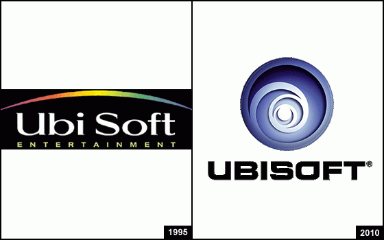
14. Ubisoft
Left: ’90s overload. Right: ’00s overload. (It was rolled out in 2003.) What will the dawn of the new decade bring?

15. Nintendo
As you may well be aware, before Nintendo did video games, they did playing cards. One translation of the original kanji is “work hard, but it remains in the hands of heaven at last”; accurate or no, that seems like a pretty apt description of the gaming experience in more than one Nintendo game.
Have a tip we should know? [email protected]