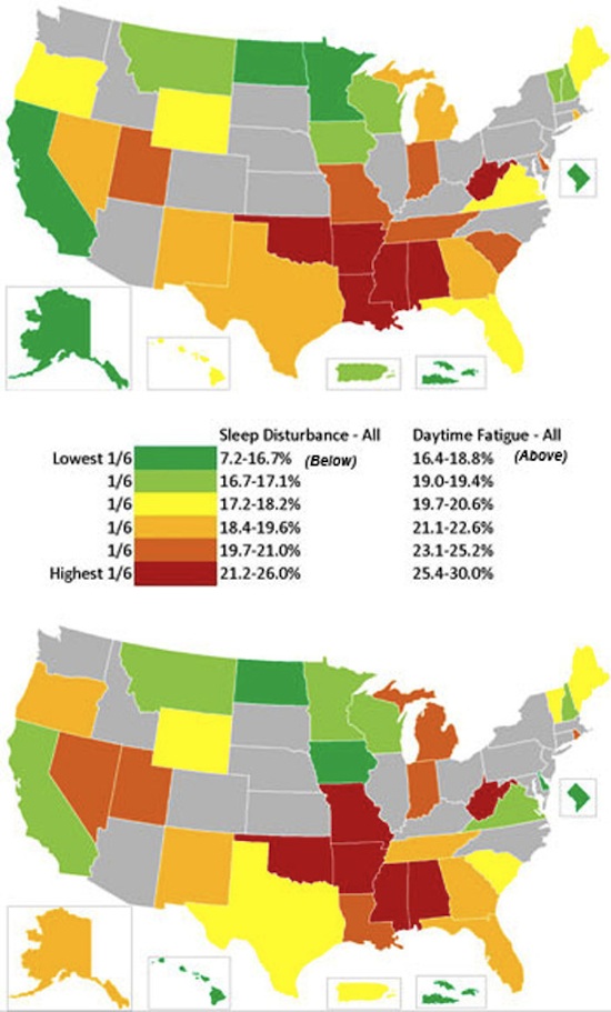
New Map Shows the Best and Worst Sleep Across these United States
The University of Pennsylvania have taken the information gathered by the Centers for Disease Control and Prevention (you know, that place from the first season of The Walking Dead) robo-calling polls and created the first “sleepiness“ map of the United States. It shows, in two separate graphics, how many people reported waking up at night and how many reported feeling fatigued during the day. Not surprisingly, there is only a little difference between the two. The researchers reported that the best sleep in America can be found on the West Coast, while the worst sleep is concentrated in the south. Though looking at this map, the Dakotas seem to be doing pretty good for themselves. See the full image, after the break.

(University of Pennsylvania via BuzzFeed)
- Square Earth knocks the “globe theory” clean out!
- Here’s all the earthquakes around Japan last year
- This map shows all the trees in the U.S.
- Highest resolution map of the moon ever made
Have a tip we should know? [email protected]