


A Not-At-All Divisive Chart of the Best and Worst TV Series Finales Ever
*Stirs the shit*
Aug 20th, 2015, 12:09 pm


Recommended Videos
You deserve everything you get, True Blood and elderly Ted.
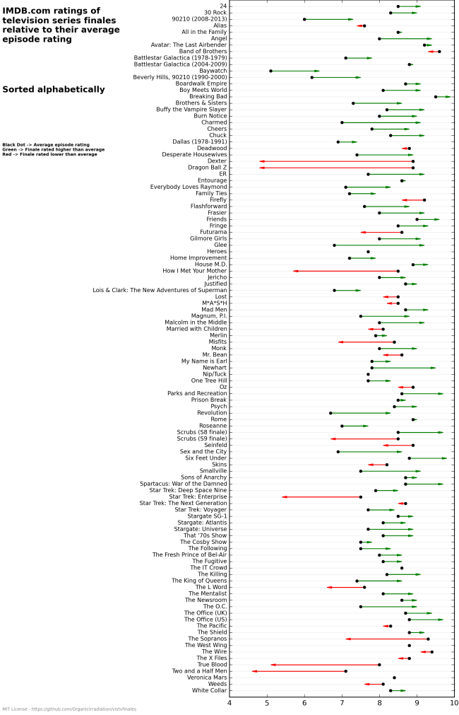
An intrepid Imgur user has posted a chart that uses a series finale’s IMDB ratings to indicate its reception. A green line indicates “finale rated higher than average,” and a red line indicates “finale rated lower than average”.
Do you agree with The Chart, or does The Chart lie?
—Please make note of The Mary Sue’s general comment policy.—
Do you follow The Mary Sue on Twitter, Facebook, Tumblr, Pinterest, & Google +?
Have a tip we should know? [email protected]