Haiti Aid, in Infographic Form
Jan 27th, 2010, 9:10 am
Recommended Videos
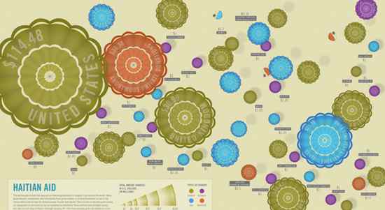
The infographic whizzes at GOOD have once again teamed up with branding and communication design firm Design Language to turn abstract numbers into compelling visuals: This time, by looking at the amount of money different countries, businesses, and NGOs have given to Haiti.
As ever in such matters, the side-by-side comparisons are the most intriguing: Private individuals gave more aid money than the UK? China didn’t give as much as UNICEF’s National Committee, which isn’t even all of UNICEF? The small west African nation of Gabon matched Goldman Sachs’ $1 million pledge?
Click on the graphic above to view GOOD’s zoomable, full-sized Flash presentation.
(Good.is via Boing Boing)
Have a tip we should know? [email protected]
