‘Big Microsoft Paint energy’: Trump’s Board of Peace logo is basically a recycled golden AI slop of the UN logo

When Donald Trump unveiled the branding for his newly announced “Board of Peace,” the world expected controversy. What it did not expect was a logo that looked like it was recycled from the UN logo by an overconfident AI prompt. Oh, and it’s dipped in gold, so you know the prompt was by Trump.
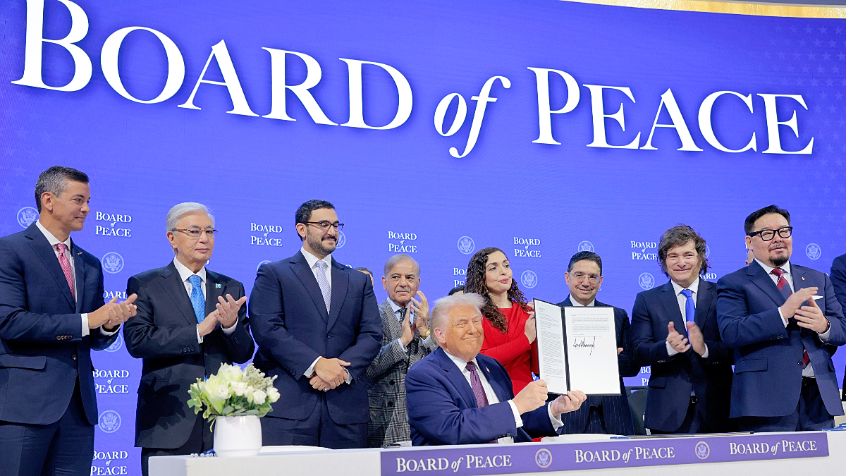
The logo was unveiled during Trump’s Board of Peace features Charter signing ceremony on Jan. 22. It features a golden laurel wreath encircling a globe, rendered in a faux-textured, almost oil-paint style. It is meant to symbolize global unity, authority, and legitimacy. Instead, it immediately drew comparisons to one of the most recognizable international symbols in the world: the United Nations emblem.
The resemblance is not subtle. The UN logo consists of a flat, minimalist world map framed by olive branches. It was designed after World War II to represent neutrality, cooperation, and peace through restraint. But Trump’s version swaps restraint for excess. You see thicker laurels, a shiny gold palette, and a globe that appears selectively cropped.
Notably, the map in Trump’s logo appears centered almost entirely on the Americas. Large portions of the Middle East, Africa, and Asia are either minimized or absent. They really thought it was the perfect design choice for a body allegedly focused on rebuilding Gaza. Ironically, the region the board claims to exist for is virtually out of the logo. That omission was not lost on critics. Nor was the irony.
It’s a gold-plated knockoff of the UN logo
One user summarized it as “the UN logo except dipped in gold and edited so the world only includes America.” Users were also disappointed, calling the logo “bizarre.” They added, “No one in the White House has any marketing or branding ability at all. And absolutely no creativity.” Several others pointed out the technical tell-tales of AI-assisted generation:
“Mixing a clip-art wreath with a pseudo-realistic, geo-textured map is a graphic design atrocity. Big Microsoft Paint energy.”
The mockery escalated once Trump’s broader plans for the board became public. He had sent membership invitations to figures like Putin, Benjamin Netanyahu, and several billionaires, while no Palestinian representatives were included. Trump himself retains veto power over decisions and control over funding mechanisms.
Every detail that emerges about the board makes the logo feel progressively less like a diplomatic symbol and more like branding for a luxury scam. “Charging $1 billion to join a committee with a recycled AI slop logo is phenomenally on brand for Trump,” one comment read. Another compared it to a bootleg sports franchise emblem. “Looks like some knock-off World Cup logo you’d see in an old Pro Evo game,” they wrote.
The criticism fits neatly into a larger pattern of Trump’s second-term visual politics. You have maximalist AI imagery, nationalist iconography, and a preference for spectacle over coherence. Just days earlier, Trump and the White House posted AI-generated images of him planting the U.S. flag in Greenland.
Another image from his Truth Social account depicted Canada, Greenland, Venezuela, and Cuba absorbed into the U.S., displayed behind him while European leaders sat awkwardly across the desk. The Board of Peace logo now joins that gallery. It’s part diplomacy, part branding exercise, part accidental self-parody.
(featured image: Chip Somodevilla/Getty Images)
Have a tip we should know? [email protected]
