Windows 8 Explorer Design is Bizarre
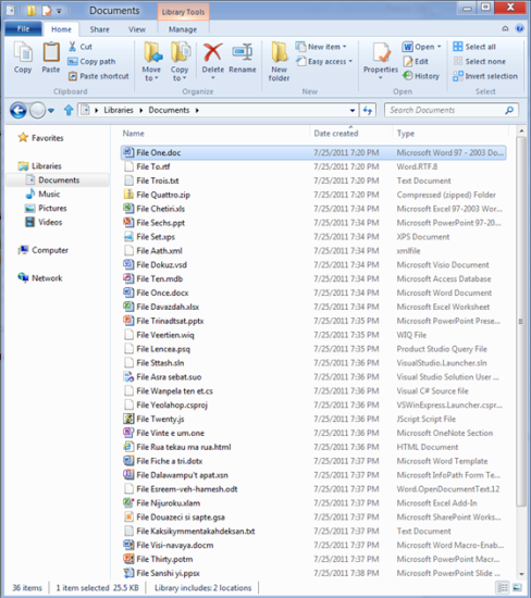
Microsoft released screenshots of the new redesign of the Explorer in the upcoming Windows 8, and the design seems a little odd, to say the least. The file display panes are fine and are pretty much the norm for Windows for a few iterations now, but the Ribbon — what Microsoft calls the toolbar and menus at the top — is reminiscent of a cluttered browser toolbar that installs itself without one’s permission. At a glance, one may quickly jump to the conclusion that the screenshots circulating around the web are some pranksters satirical take on the Windows Explorer, but these screenshots have come from Microsoft itself, along with a lengthy post explaining exactly why the toolbar and menus look like they do.
Normally, if you have to heavily explain a design choice, whether it be aesthetics or naming conventions, not only did you not quite achieve the whole point of an efficient design in the first place, but the very fact that you had to overly explain your decisions probably means you know it. It seems that is what is happening over on the Microsoft blog post on which the screenshots released.
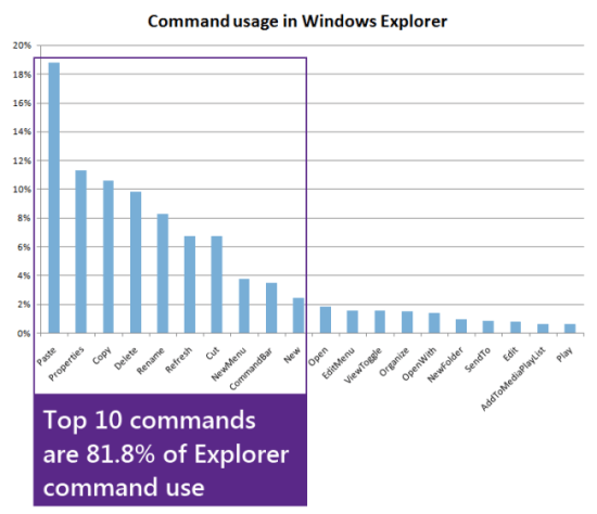
Using telemetry data, Microsoft boiled down the top commands users were using in the Explorer, and then, basically, threw them all over the Ribbon.
The above mishmosh is just one tab in the Ribbon, as one can see there are various tabs which have their own set of buttons.
As one can also see, the Up button, a feature that allows users to navigate “up” one level in the folder hierarchy is back, and according to the blog post, “far and away the most requested improvement to Explorer.”
The blog post is filled with a bunch of stats, and it seems Microsoft did their homework regarding the new interface design, however, the homework done doesn’t seem hold accessibility and cleanliness in any regard, and as shown by the new Ribbon design, eschews simplicity and accessibility for “Hey, people use these functions, let’s put them everywhere.” Judging by the amount of explanation provided alongside the screenshots’ release, it seems Microsoft isn’t too sure of their design either.
(via MSDN Blogs)
Have a tip we should know? [email protected]


