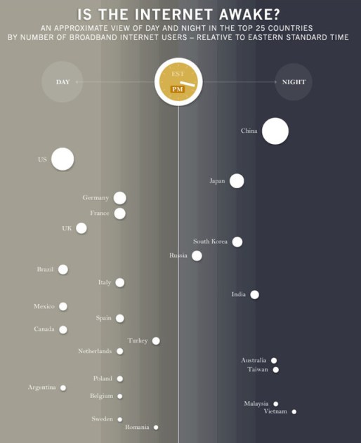
Is The Internet Awake? [Infographic]
Being global and all, sometimes it’s a little hard to know whether or not the Internet is awake. If you’re social media-ing across the globe, trying to blow up on reddit, or trying to get the most out of your tweets, that’s information that might matter to you. Also, it’s just interesting to know. Designer Bård Edlund decided to try and tackle this question in a particularly interesting way by coming up with an animated infographic that separates Internet users by country and attempts to display their probable sleep patterns and, by extension, when they’re on the ‘net.
Each country is represented by a circle, the size of which relates to its total quantity of broadband Internet users. As a country’s circle drifts from the day side into the night side, it illustrates who’s going to bed and who’s getting up so you can figure out the best time to catch Australians or talk behind their backs.
For the countries that have multiple time zones, Edlund just went with the most populous zones for the sake of simplicity. It’s also worth mentioning that while this gives you a good idea of when people are likely to be on the Internet since they can’t be on the Internet and asleep, it doesn’t really account for all those insomniacs out there, who might number greater than you’d expect. In any event, it’s definitely a neat thing to check out and think of the next time you’re trying to get mad trafficks from the Russians.
Click the image for the animated version.
(Edlund Art via Co.Design, thanks Eileen!)
- This duckling definitely does not want to be awake right now
- This Tetris alarm clock will wake you up and make sure you stay awake
Have a tip we should know? [email protected]
