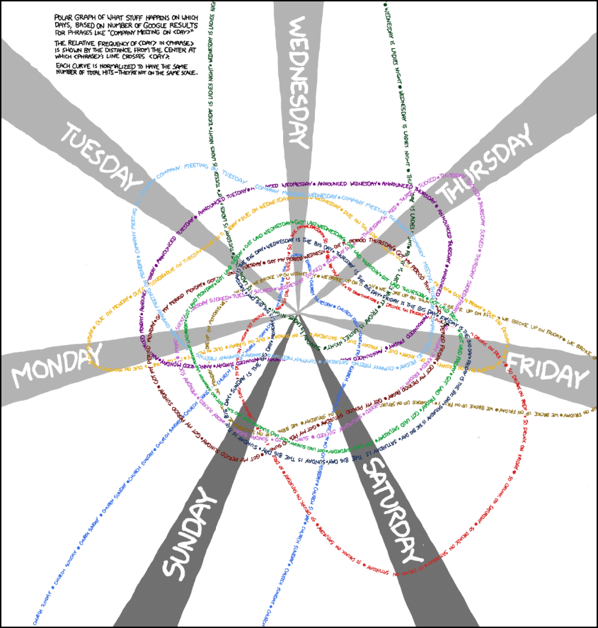
Polar Graph Shows the Relative Popularity of Phrases Based on the Day of the Week
Another day, another xkcd graph that requires an understanding of mathematics or a FAQ to comprehend. At least that’s what it feels like to me, but when you get past that outer shell, the inside is always moist and chocolaty. This particular Randall Munroe feature is a polar graph that shows which days the internet likes to do specific things. That is to say, it shows the relative popularity of phrases like “[day of the week] is the big day,” based on quantity of Google hits.
So, if you’re like me and polar coordinates helped push you to abandon computer science in favor of an English degree (or you just have a short attention span), here’s how you read this graph. The rings represent the phrases being searched, are color-coded for your convenience and are made of text of the actual phrase. Where they cross over the big, grey beam that has the day of the week on it is where the info is the important part. If the ring crosses a beam near the center, that particular phrase-day pairing is uncommon. If the ring crosses the beam at the periphery, or off-screen, that phrase-day pairing is the cat’s pajamas. It’s all explained on the graph, of course, so if my explain didn’t work for you, maybe the man himself did it better.
Bigger image below.
Spoiler: Wednesday is ladies’ night.
Legitimately full-sized image is over at xkcd and is mammoth.
(via xkcd)
Have a tip we should know? [email protected]
