Ray Larabie has given more thought than most to the question of how to make fonts and video games work together. Formerly an art director at Rockstar Toronto and currently the mastermind behind Typodermic Fonts, you may know Larabie’s font designs from games like Grand Theft Auto, Red Dead Redemption, Dragon Age: Origins, and Mass Effect. Geekosystem recently got the chance to talk to Larabie about his favorite retro gaming fonts, why screens make type design harder, and the infernal prevalence of Handel Gothic in every sci-fi game ever:
Geekosystem: What do you consider to be some of the great classic (and contemporary) gaming fonts?
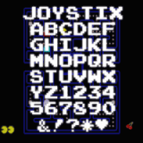
Ray Larabie: The Namco all caps arcade font used fror all their classics (Mappy, Pac-Man, Rally X) is the ultimate game font. It may be a boring choice but as soon as you see it, it says “games”. I made a version called Joystix.
Vid Kidz designed bitmap fonts that were a big inspiration for me as a kid. I’d look at these fonts in the arcade, try to remember how they’re made, then go home and make them on my TRS-80. You can see them in Robotron 2084. They had some similar techno themed fonts in Stargate and Defender. Joust had a medieval themed font, which at the time was so different from the default fonts other games used.
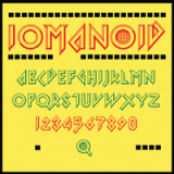
Williams was creative with fonts compared to other game companies at the time. Arkanoid (Taito) was a great example of matching the font to the game; the angles represented the ball’s path and the O represented the ball. It went really well with the game’s Tron-esque theme. Rather than just using the font on the cabinet, it was used in parts of the game as well, even in the sequel. (Iomanoid, above, is Larabie’s Arkanoid homage. –Ed.)
Wipeout changed everything. The bar for how cool a game could look with good design was set so high with Wipeout. The sequels . . . not so much. If you don’t have a copy of Wipeout, try to get the PS version and make sure it has the original manuals.
Most current games I see are using out-of-the-box fonts but some companies are putting more care into typography. Splinter Cell Conviction looks very cool with its projected images integrated into the game environment. BioWare commissioned custom fonts for Mass Effect. While that in itself doesn’t mean anything, what’s important is that the fonts were fine tuned in the game itself. So the players can read something that’s been fine-tuned for use in the game and fits the theme perfectly. Dragon Age is another one. They could have used an out-of-the-box font but they really tuned it for legibility in-game.

So do most big game developers go for new typefaces when they’re making games, or do they use stuff out-of-the-box? What, in your experience, are the most common generic types used in games, and why, if for any special reason, are they popular?
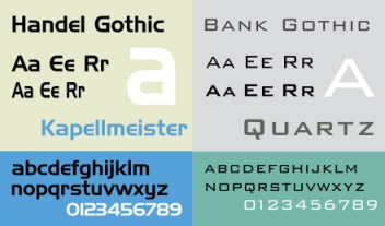
I think most game developers don’t give it much thought. For sci-fi games, it’s always Handel Gothic or Bank Gothic. Some developers really pay attention. Sidhe is a developer that starts by trying common fonts in their games. When they find one that comes close, they come to me and we use that idea as a basis for something that performs exactly the way they want.
Do you think there’s anything that makes type design for games different from design for other forms of entertainment? Would you say, for instance, that it’s inherently younger or more postmodern and referential on account of the age of the medium?
 Thematically, they’re the same. Games tend to have less hip font choices than other media. The marketing department have reign to do something more innovative with type, but the game designers have to deal with committees who want to make safe choices. I remember working on PS2 games, Sony would nitpick the fonts to the point where you wished you had used Verdana. What really makes type design for games is in-game readability.
So how does on-screen type work differently from type on, say, a box or a poster?
Yeah, so there are two main factors I deal with when making game fonts: TV screens & fuzzy rendering. Often games will render fonts to a texture so what shows up on the screen is not 1:1 pixel perfect. You have to design the font to allow for some “fuzz.” Sharp pixels make scaling problems more noticeable, so it’s best to design it to be unhinted … like text in Photoshop with the “smooth” setting. As for TV, you have the fuzzy factor to deal with as well but also problems with near horizontals and dazzle. Lines which are almost horizontal may look fine on a monitor but on TV, they just look like blurry lines. So you tend to favor pure horizontals or steep angles when designing. If lettering is too sharp on TV, it dazzles — it’s too crisp and distracting, and with older TVs you’ll get interlace flicker.
What makes video game type good? What makes it suck?
Thematic and visual inconsistency makes game type suck. I see lots of games with cool box art; you load up the game and it looks like it came from another company. Then some games have cool in-game nice stuff and lame-o box art. I think a lot of that comes from marketing and game development no cooperating enough. While, it does happen, it’s rare that a game art director knows fonts. It’s not just about having taken a typography course, but actually being up-to-date on what’s cool and what’s not. A good art director in marketing knows very well that Bank Gothic is inappropriate in a futuristic sci-fi context. It’s fine for a cowboy or steampunk game, not for space. A game art director might think it looks kind of spacey so in the game it goes. Nobody feels strongly enough about it to replace it and that’s not the marketing designers job anyway. So there it stays.
(images via Wikipedia.)
To fix it you need a company structure which forces marketing and game development to sit in a room together early on — or if you’re lucky, a game art director who’s also a font fanatic. Some font choice are not technically wrong, like Handel Gothic in a sci-fi game. It’s a 1970s font, kind of spacey. But it’s really overused. A marketing department designer with an ounce of cool would never touch that font. Yet it’s in hundreds of games.
If your marketing designer is no good, hire a good agency. Without the Designer’s Rupublic, Wipeout would have been just another ugly F-Zero clone. If you’re not cool and you want your game to look cool, whatever you do, don’t design it yourself. For about $5000 you can get an agency to choose fonts, a few design elements and a color scheme, maybe throw in a logo.


