comScore
  1. Mediaite
  2. Gossip Cop
  3. Geekosystem
  4. Styleite
  5. SportsGrid
  6. The Mary Sue
  7. The Jane Dough
  8. The Braiser

My Precious!

The Stylized DVD Jackets for Marvel’s Cinematic Universe Are Really Pretty


Sometimes you just need to look at some eye-candy. And this time that eye-candy doesn’t even involve any actual people! Instead, we invite you to feast your eyes on the artwork for Marvel Cinematic Universe: Phase One—Avengers Assembled. Yes, it’s a mouthful, but the eye-full is much easier to…swallow? Take in? In any case, Marvel Cinematic Universe is a deluxe six-movie set of all the Avengers tie-in films, and the sleeves for the individual films are quite artfully minimalistic. Just take my money, Marvel! Take it!

Click through to witness the beauty.

Tony Stark and Iron Man basking in their glory…

And kicking some butt…

The artwork for The Incredible Hulk is appropriately moody…And green…

And really gold and sunny over where Thor is…

The patriotic (and chilly) artwork for Captain America

And here’s a shot of the full set…

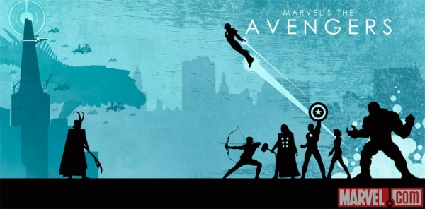
And to top it all off, here’s a promo for the set and all the movies it includes:

(via Blastr)

Are you following The Mary Sue on Twitter, Facebook, Tumblr, Pinterest, & Google +?

TAGS: | | | | | | |


  • http://twitter.com/antiavenger Mike Perry

    shutupandtakemymoney.jpg

  • Carmen Sandiego

     The designs are very admiring of Loki. 

  • http://idleprimate.blogspot.ca/ idleprimate

    those designs are all kind of ugly and seem very out of place for bluray covers for superhero movies.  they seem more informed by Mad Men era advertising.  Or some cross between retirement home brochures and communist propaganda.  can’t believe someone signed off on this.  maybe they are just supposed to look expensive and classy?

  • Kaarel Jakobson

    These are extremely awesome. Two things:

    1. I especially like those things not unlike Kirby dots in the Thor design.
    2. Notice how almost all of these contast heroes on the front cover with villains on the back… except Iron Man’s, which puts puts IM opposite Tony Stark.

  • http://twitter.com/aikaseltzer Aika

    Haha! Loki sitting on the throne like that. 

  • http://twitter.com/Totz_the_Plaid Totz_the_Plaid

    Strongly disagree! They are high-class art-nouveau pieces that represent their respective movies incredibly well!

  • http://twitter.com/Totz_the_Plaid Totz_the_Plaid

    Stark wasn’t a very good man when the movie started…

  • Anonymous

    dammit. just. take. the. money. leave. dvds.

  • http://idleprimate.blogspot.ca/ idleprimate

     yeah, just what comes to mind when i think superheroes–antiquated pastel design themes.  but hey, whatever floats your boat

  • http://www.facebook.com/profile.php?id=205000266 Anna Hight

    Jesus, with this I wouldn’t need a boyfriend. 

  • Anonymous

    I’m going to have to agree with you on that one. I don’t want that on a DVD or Blue Ray cover. The art its self is not bad, its just not what i consider appropriate for a cover to something, especially something not in that style.

  • Anonymous

    yeah, this does kinda smack of tumblr level fan art to me… You know the type that is just a silly mash-up that is not indicataive of the actual product.

X